Creating charts in Excel doesn’t just make your data look pretty – it unlocks the real stories and insights hidden in your numbers. Whether you’re building social media tutorials, driving business decisions, or just organizing team data, knowing which chart type to pick can turn a pile of rows into powerful visualizations. In this post for masterthesheets.com, you’ll learn the essentials of basic Excel chart types, see sample datasets for each, and get expert guidance on choosing the perfect chart for every scenario.
Why Charts Matter in Excel
Excel tables are great for organizing information, but rows alone rarely reveal the big picture. Charts transform raw data into visual patterns, quickly highlighting trends, comparisons, outliers, and compositions. Well-chosen charts help you:
- Communicate results more clearly in meetings and reports.
- Engage audiences on platforms like TikTok, YouTube, and Instagram.
- Focus your team’s attention on the most actionable insights.
- Spot business opportunities and problems faster.
But not all charts are created equal. Picking the right one depends on your story and your data.
The Basics: Six Essential Excel Chart Types
Let’s break down the six visualizations every spreadsheet creator and business analyst should master, each with a practical sample dataset and its best use case.
Column Chart
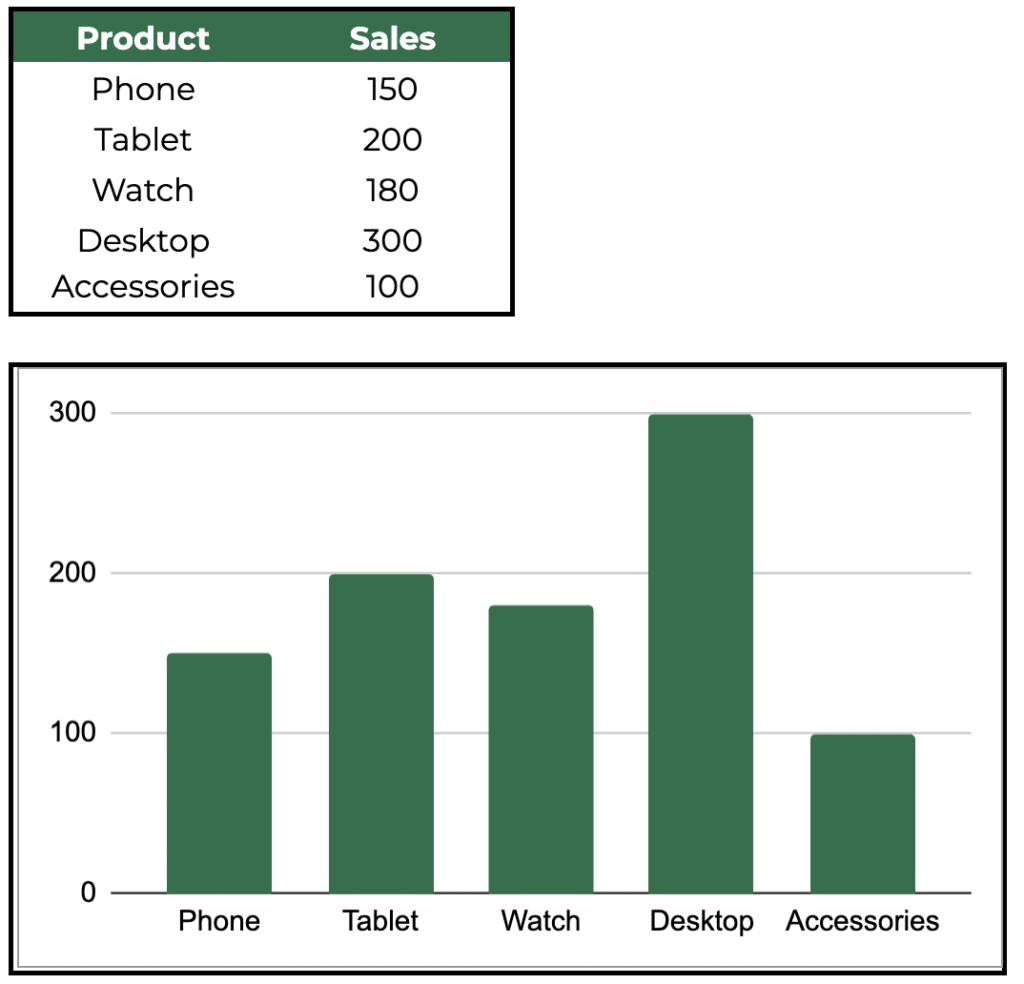
Use for: Comparing discrete values across categories. Is Product B outselling the rest? Column charts put categories side by side – perfect for product sales, survey results, or regional performance. They’re fast to interpret and ideal for presentations.
Bar Chart
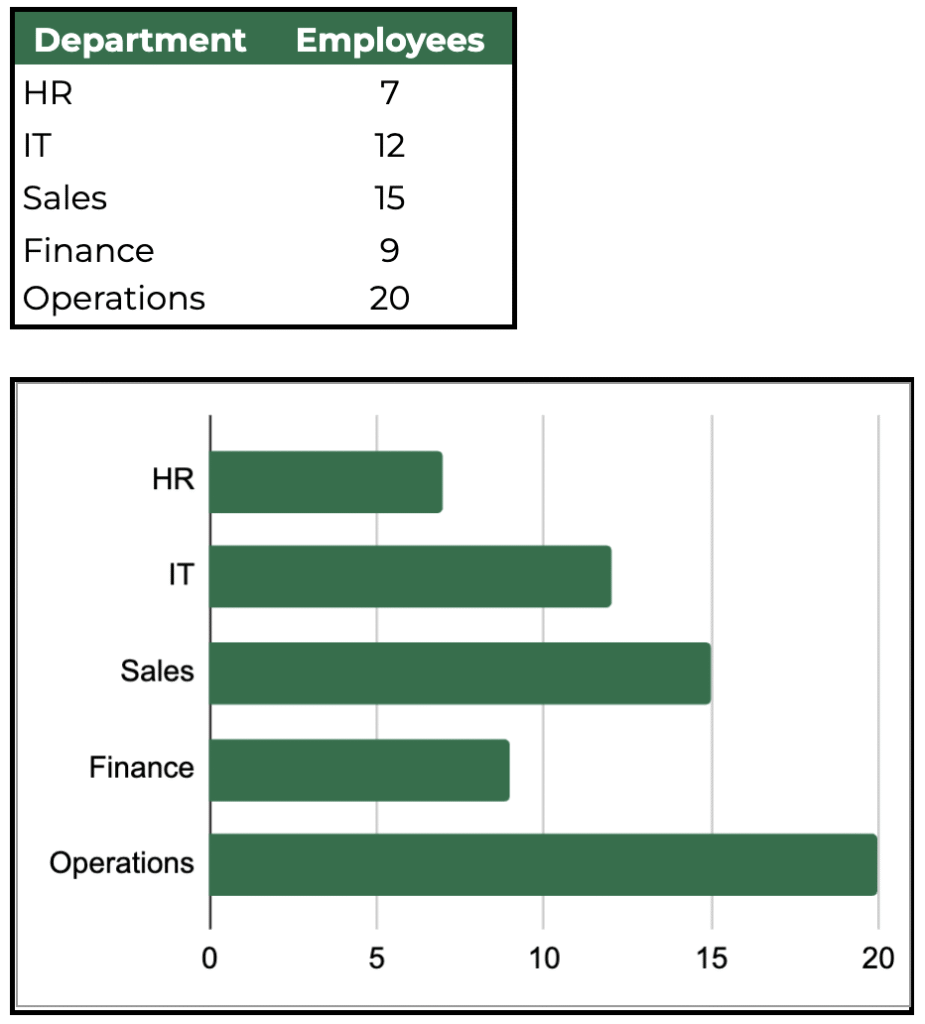
Use for: Comparing values horizontally, often when labels are long or you’re working with a crowded dataset. Bar charts show which department is largest or which category dominates, making them especially helpful for staff breakdowns, budgets, or rankings.
Line Chart
Use for: Tracking changes, trends, and dynamics over time. Line charts are your go-to for monthly revenue, web traffic, or temperature readings. They help viewers connect dots and see how variables evolve—highlighting growth spurts, dips, and outlier months.
Pie Chart
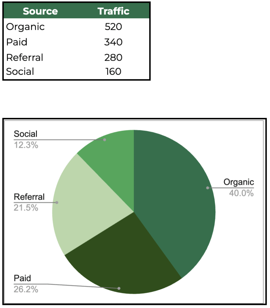
Use for: Showing how each slice contributes to the whole. Pie charts are effective for visualizing percentages, shares, or proportions—such as sources of website traffic or budget allocations. They’re quick and eye-catching, but best with up to five slices.
Area Chart
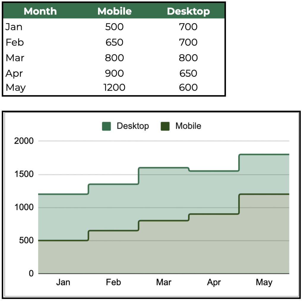
Use for: Displaying cumulative totals or stacked trends over time. Use area charts to compare different segments—like mobile vs desktop visits, or profit and expenses across months. They highlight both the overall volume and each category’s contribution.
Scatter Chart

Use for: Analyzing correlation between two numeric variables. Scatter charts are best when asking, “Does X influence Y?” For example, plotting study hours against scores shows the relationship and potential trend.
How to Choose the Right Chart Type
Here’s a simple cheat sheet:
- Comparing categories? Use Column or Bar charts.
- Tracking trends over time? Use Line or Area charts.
- Showing proportions? Use Pie charts.
- Exploring relationships? Use Scatter charts.
Always think about your story. What do you want your audience to see first? Clear, focused charts enhance impact—while crowded, mismatched visuals confuse.
Pro-Tips for Excel Chart Creation
Want to create charts in seconds? Use the Alt+F1 shortcut in Excel to instantly transform your selected data range into a default chart. This saves time and lets you prototype visuals before fine-tuning formatting. For TikTok or social tutorials, pre-select the best dataset for your chart type—matching the story you want to tell.
Personalize your chart titles, adjust colors for accessibility, and always label axes and legends for clarity. Remember, a chart is only as powerful as the story it tells.
Download and Demo: Merged Chart Dataset
To make your workflow even easier, we’ve combined all six sample datasets into a single Google sheets document with a “Chart_Type” column. Simply filter and select the relevant rows to demo each chart type in Excel or Google Sheets – great for tutorials, dashboard creation, or practice.
Conclusion
Mastering Excel’s chart types gives you an edge – whether teaching on masterthesheets.com, running a business, or creating viral TikTok content. Start with the right dataset, pick the chart that best displays your insight, and let Excel’s visualization tools do the rest. The right chart transforms numbers into actionable stories. Ready to upgrade your data game? Download the combined dataset and experiment with every basic chart type today!